节点用户界面元素(Node user interface elements)
n8n 提供了一组预定义的 UI 组件(基于 JSON 文件),允许用户输入各种数据类型。n8n 提供了以下 UI 元素。
🌐 n8n provides a set of predefined UI components (based on a JSON file) that allows users to input all sorts of data types. The following UI elements are available in n8n.
字符串(String)
基本配置:
🌐 Basic configuration:
 1
 2
 3
 4
 5
 6
 7
 8
 9
10
11
12
13
14
15
16
17
18 | {
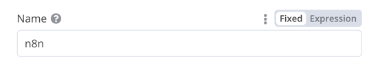
displayName: Name, // The value the user sees in the UI
name: name, // The name used to reference the element UI within the code
type: string,
required: true, // Whether the field is required or not
default: 'n8n',
description: 'The name of the user',
displayOptions: { // the resources and operations to display this element with
show: {
resource: [
// comma-separated list of resource names
],
operation: [
// comma-separated list of operation names
]
}
},
}
|
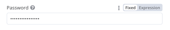
用于输入密码的字符串字段:
🌐 String field for inputting passwords:
 1
 2
 3
 4
 5
 6
 7
 8
 9
10
11
12
13
14
15
16
17
18
19
20
21 | {
displayName: 'Password',
name: 'password',
type: 'string',
required: true,
typeOptions: {
password: true,
},
default: '',
description: `User's password`,
displayOptions: { // the resources and operations to display this element with
show: {
resource: [
// comma-separated list of resource names
],
operation: [
// comma-separated list of operation names
]
}
},
}
|
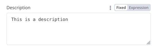
包含多行的字符串字段:
🌐 String field with more than one row:
 1
 2
 3
 4
 5
 6
 7
 8
 9
10
11
12
13
14
15
16
17
18
19
20
21 | {
displayName: 'Description',
name: 'description',
type: 'string',
required: true,
typeOptions: {
rows: 4,
},
default: '',
description: 'Description',
displayOptions: { // the resources and operations to display this element with
show: {
resource: [
// comma-separated list of resource names
],
operation: [
// comma-separated list of operation names
]
}
},
}
|
支持数据键的拖放操作(Support drag and drop for data keys)
用户可以通过拖放数据值将其映射到字段。拖放会创建一个表达式来加载数据值。n8n 会自动支持此操作。
🌐 Users can drag and drop data values to map them to fields. Dragging and dropping creates an expression to load the data value. n8n supports this automatically.
你需要添加一个额外的配置选项以支持拖放数据键:
🌐 You need to add an extra configuration option to support dragging and dropping data keys:
requiresDataPath: 'single':用于需要单个字符串的字段。requiresDataPath: 'multiple':适用于可以接受逗号分隔字符串列表的字段。
Compare Datasets 节点代码 有示例。
🌐 The Compare Datasets node code has examples.
数字(Number)
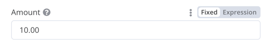
带小数点的数字字段:
🌐 Number field with decimal points:
 1
 2
 3
 4
 5
 6
 7
 8
 9
10
11
12
13
14
15
16
17
18
19
20
21
22
23 | {
displayName: 'Amount',
name: 'amount',
type: 'number',
required: true,
typeOptions: {
maxValue: 10,
minValue: 0,
numberPrecision: 2,
},
default: 10.00,
description: 'Your current amount',
displayOptions: { // the resources and operations to display this element with
show: {
resource: [
// comma-separated list of resource names
],
operation: [
// comma-separated list of operation names
]
}
},
}
|
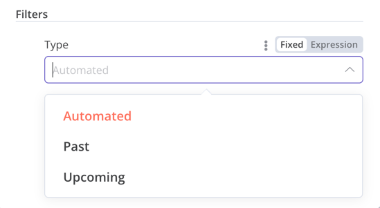
集合(Collection)
当需要显示可选字段时,使用 collection 类型。
🌐 Use the collection type when you need to display optional fields.
 1
 2
 3
 4
 5
 6
 7
 8
 9
10
11
12
13
14
15
16
17
18
19
20
21
22
23
24
25
26
27
28
29
30
31
32
33
34
35
36
37
38
39 | {
displayName: 'Filters',
name: 'filters',
type: 'collection',
placeholder: 'Add Field',
default: {},
options: [
{
displayName: 'Type',
name: 'type',
type: 'options',
options: [
{
name: 'Automated',
value: 'automated',
},
{
name: 'Past',
value: 'past',
},
{
name: 'Upcoming',
value: 'upcoming',
},
],
default: '',
},
],
displayOptions: { // the resources and operations to display this element with
show: {
resource: [
// comma-separated list of resource names
],
operation: [
// comma-separated list of operation names
]
}
},
}
|
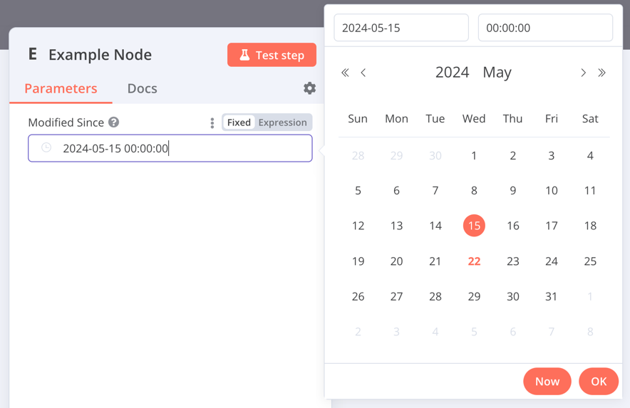
DateTime
dateTime 类型提供了一个日期选择器。
🌐 The dateTime type provides a date picker.
 1
 2
 3
 4
 5
 6
 7
 8
 9
10
11
12
13
14
15
16
17 | {
displayName: 'Modified Since',
name: 'modified_since',
type: 'dateTime',
default: '',
description: 'The date and time when the file was last modified',
displayOptions: { // the resources and operations to display this element with
show: {
resource: [
// comma-separated list of resource names
],
operation: [
// comma-separated list of operation names
]
}
},
}
|
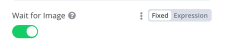
布尔值(Boolean)
boolean 类型增加了一个用于输入真或假的切换开关。
🌐 The boolean type adds a toggle for entering true or false.
 1
 2
 3
 4
 5
 6
 7
 8
 9
10
11
12
13
14
15
16
17 | {
displayName: 'Wait for Image',
name: 'waitForImage',
type: 'boolean',
default: true, // Initial state of the toggle
description: 'Whether to wait for the image or not',
displayOptions: { // the resources and operations to display this element with
show: {
resource: [
// comma-separated list of resource names
],
operation: [
// comma-separated list of operation names
]
}
},
}
|
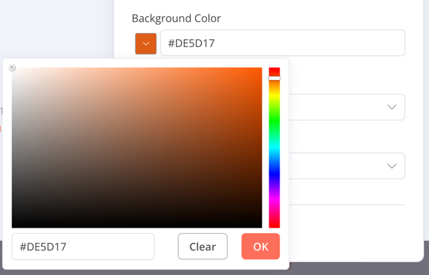
颜色(Color)
color 类型提供了一个颜色选择器。
🌐 The color type provides a color selector.
 1
 2
 3
 4
 5
 6
 7
 8
 9
10
11
12
13
14
15
16 | {
displayName: 'Background Color',
name: 'backgroundColor',
type: 'color',
default: '', // Initially selected color
displayOptions: { // the resources and operations to display this element with
show: {
resource: [
// comma-separated list of resource names
],
operation: [
// comma-separated list of operation names
]
}
},
}
|
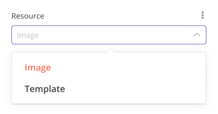
选项(Options)
options 类型增加了一个选项列表。用户可以选择一个值。
🌐 The options type adds an options list. Users can select a single value.
 1
 2
 3
 4
 5
 6
 7
 8
 9
10
11
12
13
14
15
16
17
18
19
20
21
22
23
24
25
26
27 | {
displayName: 'Resource',
name: 'resource',
type: 'options',
options: [
{
name: 'Image',
value: 'image',
},
{
name: 'Template',
value: 'template',
},
],
default: 'image', // The initially selected option
description: 'Resource to consume',
displayOptions: { // the resources and operations to display this element with
show: {
resource: [
// comma-separated list of resource names
],
operation: [
// comma-separated list of operation names
]
}
},
}
|
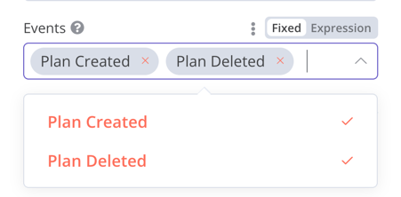
多选项(Multi-options)
multiOptions 类型添加了一个选项列表。用户可以选择多个值。
🌐 The multiOptions type adds an options list. Users can select more than one value.
 1
 2
 3
 4
 5
 6
 7
 8
 9
10
11
12
13
14
15
16
17
18
19
20
21
22
23
24
25
26
27 | {
displayName: 'Events',
name: 'events',
type: 'multiOptions',
options: [
{
name: 'Plan Created',
value: 'planCreated',
},
{
name: 'Plan Deleted',
value: 'planDeleted',
},
],
default: [], // Initially selected options
description: 'The events to be monitored',
displayOptions: { // the resources and operations to display this element with
show: {
resource: [
// comma-separated list of resource names
],
operation: [
// comma-separated list of operation names
]
}
},
}
|
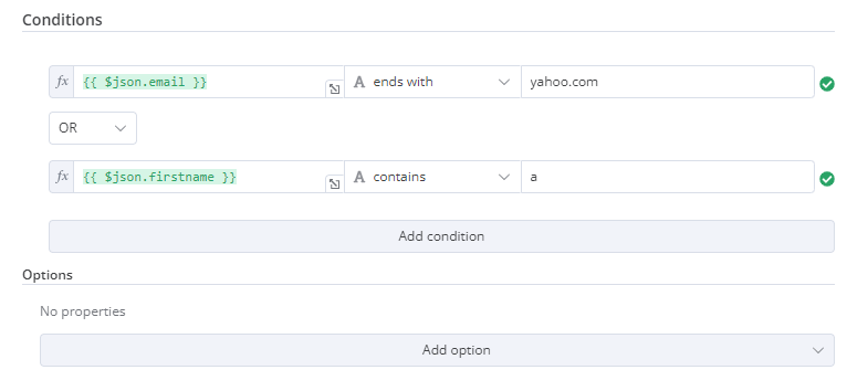
筛选(Filter)
使用此组件评估、匹配或过滤传入数据。
🌐 Use this component to evaluate, match, or filter incoming data.
这是来自 n8n 自身 If 节点的代码。它展示了一个与 collection 组件配合工作的过滤器组件,用户可以在其中配置过滤器的行为。
🌐 This is the code from n8n's own If node. It shows a filter component working with a collection component where users can configure the filter's behavior.
 1
 2
 3
 4
 5
 6
 7
 8
 9
10
11
12
13
14
15
16
17
18
19
20
21
22
23
24
25
26
27
28
29
30
31
32
33
34
35
36
37 | {
displayName: 'Conditions',
name: 'conditions',
placeholder: 'Add Condition',
type: 'filter',
default: {},
typeOptions: {
filter: {
// Use the user options (below) to determine filter behavior
caseSensitive: '={{!$parameter.options.ignoreCase}}',
typeValidation: '={{$parameter.options.looseTypeValidation ? "loose" : "strict"}}',
},
},
},
{
displayName: 'Options',
name: 'options',
type: 'collection',
placeholder: 'Add option',
default: {},
options: [
{
displayName: 'Ignore Case',
description: 'Whether to ignore letter case when evaluating conditions',
name: 'ignoreCase',
type: 'boolean',
default: true,
},
{
displayName: 'Less Strict Type Validation',
description: 'Whether to try casting value types based on the selected operator',
name: 'looseTypeValidation',
type: 'boolean',
default: true,
},
],
},
|
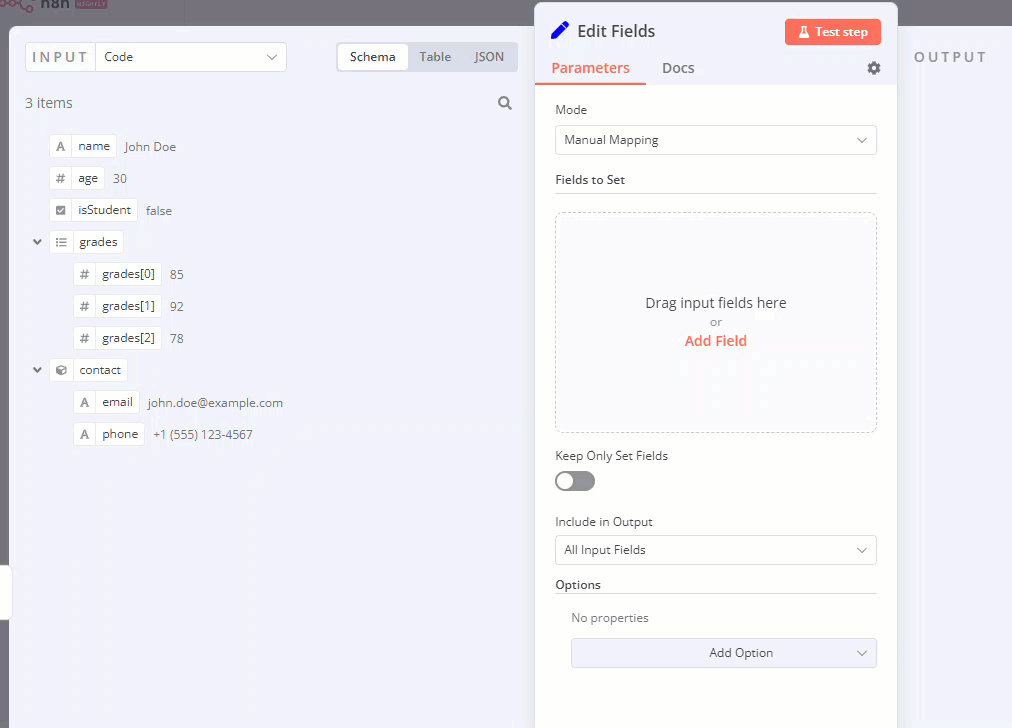
任务集合(拖放)(Assignment collection (drag and drop))
当你希望用户通过一次拖放操作预先填写名称和值参数时,请使用拖放组件。
🌐 Use the drag and drop component when you want users to pre-fill name and value parameters with a single drag interaction.
| {
displayName: 'Fields to Set',
name: 'assignments',
type: 'assignmentCollection',
default: {},
},
|
你可以在 n8n 的 编辑字段(设置)节点 中看到一个示例:
🌐 You can see an example in n8n's Edit Fields (Set) node:
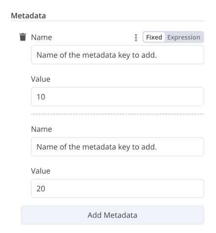
修复集合(Fixed collection)
使用 fixedCollection 类型来对语义相关的字段进行分组。
🌐 Use the fixedCollection type to group fields that are semantically related.
1
2
3
4
5
6
7
8
9
10
11
12
13
14
15
16
17
18
19
20
21
22
23
24
25
26
27
28
29
30
31
32
33
34
35
36
37
38
39
40
41
42 | {
displayName: 'Metadata',
name: 'metadataUi',
placeholder: 'Add Metadata',
type: 'fixedCollection',
default: '',
typeOptions: {
multipleValues: true,
},
description: '',
options: [
{
name: 'metadataValues',
displayName: 'Metadata',
values: [
{
displayName: 'Name',
name: 'name',
type: 'string',
default: 'Name of the metadata key to add.',
},
{
displayName: 'Value',
name: 'value',
type: 'string',
default: '',
description: 'Value to set for the metadata key.',
},
],
},
],
displayOptions: { // the resources and operations to display this element with
show: {
resource: [
// comma-separated list of resource names
],
operation: [
// comma-separated list of operation names
]
}
},
}
|
资源定位器(Resource locator)
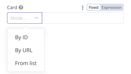
资源定位器元素可帮助用户在外部服务中查找特定资源,例如 Trello 中的卡片或标签。
🌐 The resource locator element helps users find a specific resource in an external service, such as a card or label in Trello.
可以使用以下选项:
🌐 The following options are available:
- 身份证
- 网址
- 列表:允许用户从预先填充的列表中选择或搜索。此选项需要更多的编码,因为你必须填充列表,并在选择支持搜索时处理搜索功能。
你可以选择要包含的事件类型。
🌐 You can choose which types to include.
示例:
🌐 Example:
 1
 2
 3
 4
 5
 6
 7
 8
 9
10
11
12
13
14
15
16
17
18
19
20
21
22
23
24
25
26
27
28
29
30
31
32
33
34
35
36
37
38
39
40
41
42
43
44
45
46
47
48
49
50
51
52
53
54
55
56
57
58
59
60
61
62
63
64
65
66
67
68
69
70
71
72
73
74
75
76 | {
displayName: 'Card',
name: 'cardID',
type: 'resourceLocator',
default: '',
description: 'Get a card',
modes: [
{
displayName: 'ID',
name: 'id',
type: 'string',
hint: 'Enter an ID',
validation: [
{
type: 'regex',
properties: {
regex: '^[0-9]',
errorMessage: 'The ID must start with a number',
},
},
],
placeholder: '12example',
// How to use the ID in API call
url: '=http://api-base-url.com/?id={{$value}}',
},
{
displayName: 'URL',
name: 'url',
type: 'string',
hint: 'Enter a URL',
validation: [
{
type: 'regex',
properties: {
regex: '^http',
errorMessage: 'Invalid URL',
},
},
],
placeholder: 'https://example.com/card/12example/',
// How to get the ID from the URL
extractValue: {
type: 'regex',
regex: 'example.com/card/([0-9]*.*)/',
},
},
{
displayName: 'List',
name: 'list',
type: 'list',
typeOptions: {
// You must always provide a search method
// Write this method within the methods object in your base file
// The method must populate the list, and handle searching if searchable: true
searchListMethod: 'searchMethod',
// If you want users to be able to search the list
searchable: true,
// Set to true if you want to force users to search
// When true, users can't browse the list
// Or false if users can browse a list
searchFilterRequired: true,
},
},
],
displayOptions: {
// the resources and operations to display this element with
show: {
resource: [
// comma-separated list of resource names
],
operation: [
// comma-separated list of operation names
],
},
},
},
|
请参阅以下内容以获取实时示例。
🌐 Refer to the following for live examples:
资源映射器(Resource mapper)
如果你的节点执行插入、更新或 upsert 操作,则需要以所集成服务支持的格式从节点发送数据。一种常见的做法是在发送数据的节点之前使用 Set 节点,将数据转换为与所连接服务的 schema 匹配的格式。资源映射器(resource mapper)UI 组件提供了一种方法,可以直接在节点内将数据转换为所需的格式,而无需使用 Set 节点。资源映射器组件还可以根据节点中提供的 schema 验证输入数据,并将输入数据转换为预期类型。
🌐 If your node performs insert, update, or upsert operations, you need to send data from the node in a format supported by the service you're integrating with. A common pattern is to use a Set node before the node that sends data, to convert the data to match the schema of the service you're connecting to. The resource mapper UI component provides a way to get data into the required format directly within the node, rather than using a Set node. The resource mapper component can also validate input data against the schema provided in the node, and cast input data into the expected type.
Mapping and matching
Mapping is the process of setting the input data to use as values when updating row(s). Matching is the process of using column names to identify the row(s) to update.
 1
 2
 3
 4
 5
 6
 7
 8
 9
10
11
12
13
14
15
16
17
18
19
20
21
22
23
24
25
26
27
28
29
30
31
32 | {
displayName: 'Columns',
name: 'columns', // The name used to reference the element UI within the code
type: 'resourceMapper', // The UI element type
default: {
// mappingMode can be defined in the component (mappingMode: 'defineBelow')
// or you can attempt automatic mapping (mappingMode: 'autoMapInputData')
mappingMode: 'defineBelow',
// Important: always set default value to null
value: null,
},
required: true,
// See "Resource mapper type options interface" below for the full typeOptions specification
typeOptions: {
resourceMapper: {
resourceMapperMethod: 'getMappingColumns',
mode: 'update',
fieldWords: {
singular: 'column',
plural: 'columns',
},
addAllFields: true,
multiKeyMatch: true,
supportAutoMap: true,
matchingFieldsLabels: {
title: 'Custom matching columns title',
description: 'Help text for custom matching columns',
hint: 'Below-field hint for custom matching columns',
},
},
},
},
|
请参阅 Postgres 节点(版本 2),了解使用数据库模式的实时示例。
🌐 Refer to the Postgres node (version 2) for a live example using a database schema.
请参阅 Google Sheets 节点(版本 2) 了解使用无模式服务的实时示例。
🌐 Refer to the Google Sheets node (version 2) for a live example using a schema-less service.
资源映射器类型选项接口(Resource mapper type options interface)
typeOptions 部分必须实现以下接口:
🌐 The typeOptions section must implement the following interface:
 1
 2
 3
 4
 5
 6
 7
 8
 9
10
11
12
13
14
15
16
17
18
19
20
21
22
23
24
25
26
27
28
29
30 | export interface ResourceMapperTypeOptions {
// The name of the method where you fetch the schema
// Refer to the Resource mapper method section for more detail
resourceMapperMethod: string;
// Choose the mode for your operation
// Supported modes: add, update, upsert
mode: 'add' | 'update' | 'upsert';
// Specify labels for fields in the UI
fieldWords?: { singular: string; plural: string };
// Whether n8n should display a UI input for every field when node first added to workflow
// Default is true
addAllFields?: boolean;
// Specify a message to show if no fields are fetched from the service
// (the call is successful but the response is empty)
noFieldsError?: string;
// Whether to support multi-key column matching
// multiKeyMatch is for update and upsert only
// Default is false
// If true, the node displays a multi-select dropdown for the matching column selector
multiKeyMatch?: boolean;
// Whether to support automatic mapping
// If false, n8n hides the mapping mode selector field and sets mappingMode to defineBelow
supportAutoMap?: boolean;
// Custom labels for the matching columns selector
matchingFieldsLabels?: {
title?: string;
description?: string;
hint?: string;
};
}
|
资源映射器方法(Resource mapper method)
此方法包含用于获取数据模式的节点特定逻辑。每个节点都必须实现自己的模式获取逻辑,并根据模式设置每个 UI 字段。
🌐 This method contains your node-specific logic for fetching the data schema. Every node must implement its own logic for fetching the schema, and setting up each UI field according to the schema.
它必须返回一个实现 ResourceMapperFields 接口的值:
🌐 It must return a value that implements the ResourceMapperFields interface:
 1
 2
 3
 4
 5
 6
 7
 8
 9
10
11
12
13
14
15
16
17
18
19
20
21
22
23
24 | interface ResourceMapperField {
// Field ID as in the service
id: string;
// Field label
displayName: string;
// Whether n8n should pre-select the field as a matching field
// A matching field is a column used to identify the rows to modify
defaultMatch: boolean;
// Whether the field can be used as a matching field
canBeUsedToMatch?: boolean;
// Whether the field is required by the schema
required: boolean;
// Whether to display the field in the UI
// If false, can't be used for matching or mapping
display: boolean;
// The data type for the field
// These correspond to UI element types
// Supported types: string, number, dateTime, boolean, time, array, object, options
type?: FieldType;
// Added at runtime if the field is removed from mapping by the user
removed?: boolean;
// Specify options for enumerated types
options?: INodePropertyOptions[];
}
|
请参阅 Postgres 资源映射方法 和 Google Sheets 资源映射方法 了解实际示例。
🌐 Refer to the Postgres resource mapping method and Google Sheets resource mapping method for live examples.
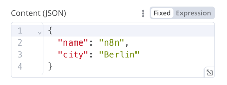
JSON
 1
 2
 3
 4
 5
 6
 7
 8
 9
10
11
12
13
14
15
16
17 | {
displayName: 'Content (JSON)',
name: 'content',
type: 'json',
default: '',
description: '',
displayOptions: { // the resources and operations to display this element with
show: {
resource: [
// comma-separated list of resource names
],
operation: [
// comma-separated list of operation names
]
}
},
}
|
超文本标记语言(HTML)
HTML 编辑器允许用户在工作流中创建 HTML 模板。该编辑器支持标准 HTML、<style> 标签中的 CSS,以及用 {{}} 封装的表达式。用户可以添加 <script> 标签来引入额外的 JavaScript。n8n 在工作流执行过程中不会运行这些 JavaScript。
🌐 The HTML editor allows users to create HTML templates in their workflows. The editor supports standard HTML, CSS in <style> tags, and expressions wrapped in {{}}. Users can add <script> tags to pull in additional JavaScript. n8n doesn't run this JavaScript during workflow execution.
| {
displayName: 'HTML Template', // The value the user sees in the UI
name: 'html', // The name used to reference the element UI within the code
type: 'string',
typeOptions: {
editor: 'htmlEditor',
},
default: placeholder, // Loads n8n's placeholder HTML template
noDataExpression: true, // Prevent using an expression for the field
description: 'HTML template to render',
},
|
请参阅 Html.node.ts 获取实时示例。
🌐 Refer to Html.node.ts for a live example.
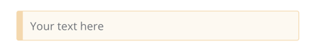
通知(Notice)
显示一个带有提示或额外信息的黄色框。有关如何编写良好提示和信息文本,请参考 Node UI 设计。
🌐 Display a yellow box with a hint or extra info. Refer to Node UI design for guidance on writing good hints and info text.
| {
displayName: 'Your text here',
name: 'notice',
type: 'notice',
default: '',
},
|
提示(Hints)
有两种类型的提示:参数提示和节点提示:
🌐 There are two types of hints: parameter hints and node hints:
- 参数提示是用户输入字段下方的一小段文本。
- 节点提示比Notice更强大、更灵活。可以在输入面板、输出面板或节点详情视图中使用它们来显示更长的提示。
添加参数提示(Add a parameter hint)
将 hint 参数添加到 UI 元素中:
🌐 Add the hint parameter to a UI element:
| {
displayName: 'URL',
name: 'url',
type: 'string',
hint: 'Enter a URL',
...
}
|
添加节点提示(Add a node hint)
在节点 description 的 hints 属性中定义节点的提示:
🌐 Define the node's hints in the hints property within the node description:
 1
 2
 3
 4
 5
 6
 7
 8
 9
10
11
12
13
14
15
16
17
18
19 | description: INodeTypeDescription = {
...
hints: [
{
// The hint message. You can use HTML.
message: "This node has many input items. Consider enabling <b>Execute Once</b> in the node\'s settings.",
// Choose from: info, warning, danger. The default is 'info'.
// Changes the color. info (grey), warning (yellow), danger (red)
type: 'info',
// Choose from: inputPane, outputPane, ndv. By default n8n displays the hint in both the input and output panels.
location: 'outputPane',
// Choose from: always, beforeExecution, afterExecution. The default is 'always'
whenToDisplay: 'beforeExecution',
// Optional. An expression. If it resolves to true, n8n displays the message. Defaults to true.
displayCondition: '={{ $parameter["operation"] === "select" && $input.all().length > 1 }}'
}
]
...
}
|
向编程风格节点添加动态提示(Add a dynamic hint to a programmatic-style node)
在编程风格的节点中,你可以创建一个包含节点执行信息的动态消息。由于它依赖于节点的输出数据,因此在执行之前无法显示此类型的提示。
🌐 In programmatic-style nodes you can create a dynamic message that includes information from the node execution. As it relies on the node output data, you can't display this type of hint until after execution.
1
2
3
4
5
6
7
8
9
10
11
12
13 | if (operation === 'select' && items.length > 1 && !node.executeOnce) {
// Expects two parameters: NodeExecutionData and an array of hints
return new NodeExecutionOutput(
[returnData],
[
{
message: `This node ran ${items.length} times, once for each input item. To run for the first item only, enable <b>Execute once</b> in the node settings.`,
location: 'outputPane',
},
],
);
}
return [returnData];
|
要查看程序化风格节点中动态提示的实时示例,请查看 Split Out 节点代码。
🌐 For a live example of a dynamic hint in a programmatic-style node, view the Split Out node code.